My fave projects
I’ve been super fortunate to work on some incredible jazz with some great folks. Here’s just a handful of them. Hope you enjoy!

SVA’s INK
INK really sparked my passion for product design. During the final half of my undergrad, I teamed up with some amazing folks to create, edit, and design a digital comics magazine for the cartooning students at The School of Visual Arts in NYC. It came out just as the iPad was making waves, and it was open to everyone for free. We packed it with cool features like videos, panel-to-panel view, and super easy navigation. It was such a hit that Wired even wrote about it! It was a labor of love, and I still cherish the memories of it.
More importantly, INK continues to this day!
Dark Mode
For the longest time, folks in our product team was asking to have a dark mode for our apps (Grubhub and Seamless). Sadly, leadership never could get it prioritized for one reason or another. Until I put some screens together for our annual hackathon. It was an immediate hit and finally got the green light 🖤
Grubhub's Blog
When first joining Grubhub I noticed we had a blog that was hosted on our own domain. Around that time I just received the Medium article of the day. I pitched to our leadership team to reboot our blog over at Medium and they would see the number of readership double.
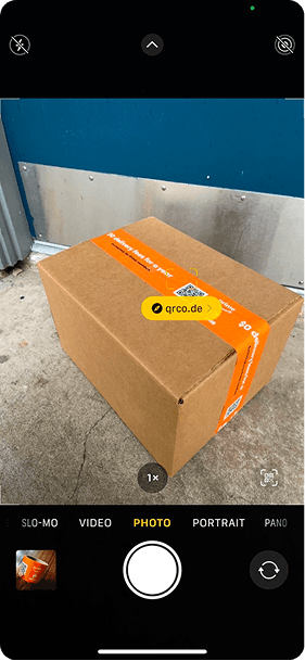
Amazon Box
Every year Grubhub hosts an internal hackathon. In 2023, they had a theme, which was to create a product/service that would strengthen the partnership and relationship we had with Amazon. Since we are a digital product/service company everyone focused around digital experiences. However, that wasn’t the case for me. What’s the most iconic product Amazon has… their box. So it was immediately obvious that the quickest way to do the prototype was to do the tape and have a QR code that could send you to the current Prime X Grubhub+ partnership page. So I designed the tape made the QR code.
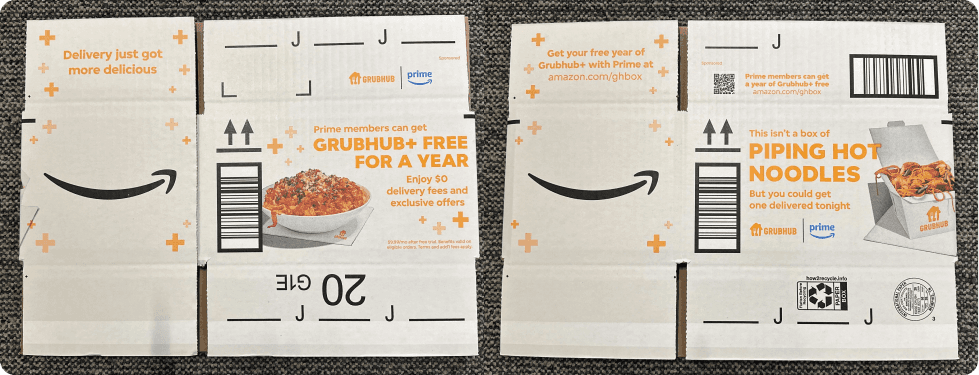
It was such a success that I got to contribute to the full-on design of the entire box. Out of that hackathon, it was the only product that became public.
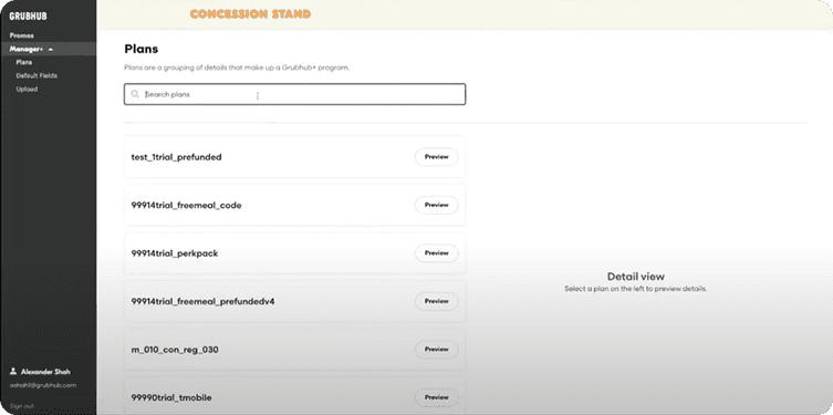
Manager+
Design isn’t about how it looks, but how something is built.
To tweak the front end of Grubhub’s diner platform, developers had to do it by hand. That just wouldn’t cut it for the speed and variety Grubhub+ needed. Early on, they came up with a spreadsheet that acted like a poor man’s CMS. Now, content could be updated quickly. The catch was that it was an open spreadsheet with lots of tricky data that was easy to mess up, leading to 500 errors. This was too frequent so we had to create Grubhub’s first CMS. We focused on security features, a simple and easy-to-use interface, and quality-of-life improvements that would make updating a breeze.
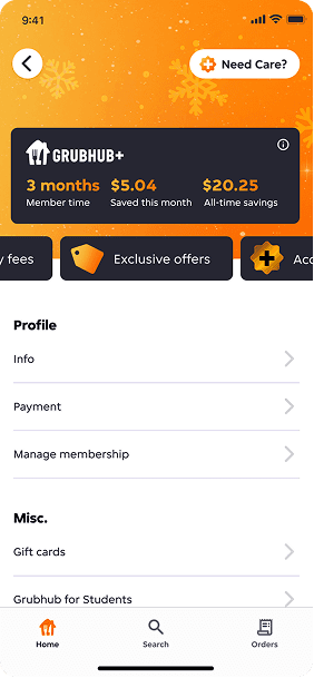
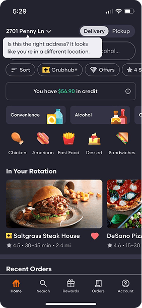
Grubhub+ Account
Imagine if I told you that I could boost your KPIs by 25% with just a few tests? That’s exactly what we did with our member account experience. It involved gently reminding people of the value they’re receiving, being open about their relationship with us, and finding the perfect mix of information they need. All of this led to long-term success. I wish I had known the outcome so I could pitch and show how impactful focusing on design can be.