Grubhub.com
Grubhub’s most visited page gets a complete revamp from the ground up.

When I joined Grubhub in early 2016, the company had just wrapped up a rebranding and was rolling out these changes to the diner product. Unfortunately, when they refreshed the main page (grubhub.com), they just gave it a new coat of paint, updating the assets, colors, and fonts. But they didn’t change the page’s underlying design.
The issue was that the page was quite outdated, not just in terms of content but also in how easy it was to use. Phones were the most popular way people visited our site, and the front page wasn’t fully designed with that in mind. It felt more like a temporary fix than a long-term solution. Plus, it was clear that different people in charge were trying to make their mark on the page, which made it seem disjointed instead of a cohesive whole.
Having led the design of our menu pages, which are the most visited on our site, and successfully onboarding customers to order, I was fortunate enough to design Grubhub.com’s page.
My goal was simple:
Focus on what the audience really wants
Use a mobile-first approach
Create a narratively cohesive page
Strengthen the connection to our rebrand
Load quickly
Knowing what to do was easy. Getting everyone on board was the real challenge.
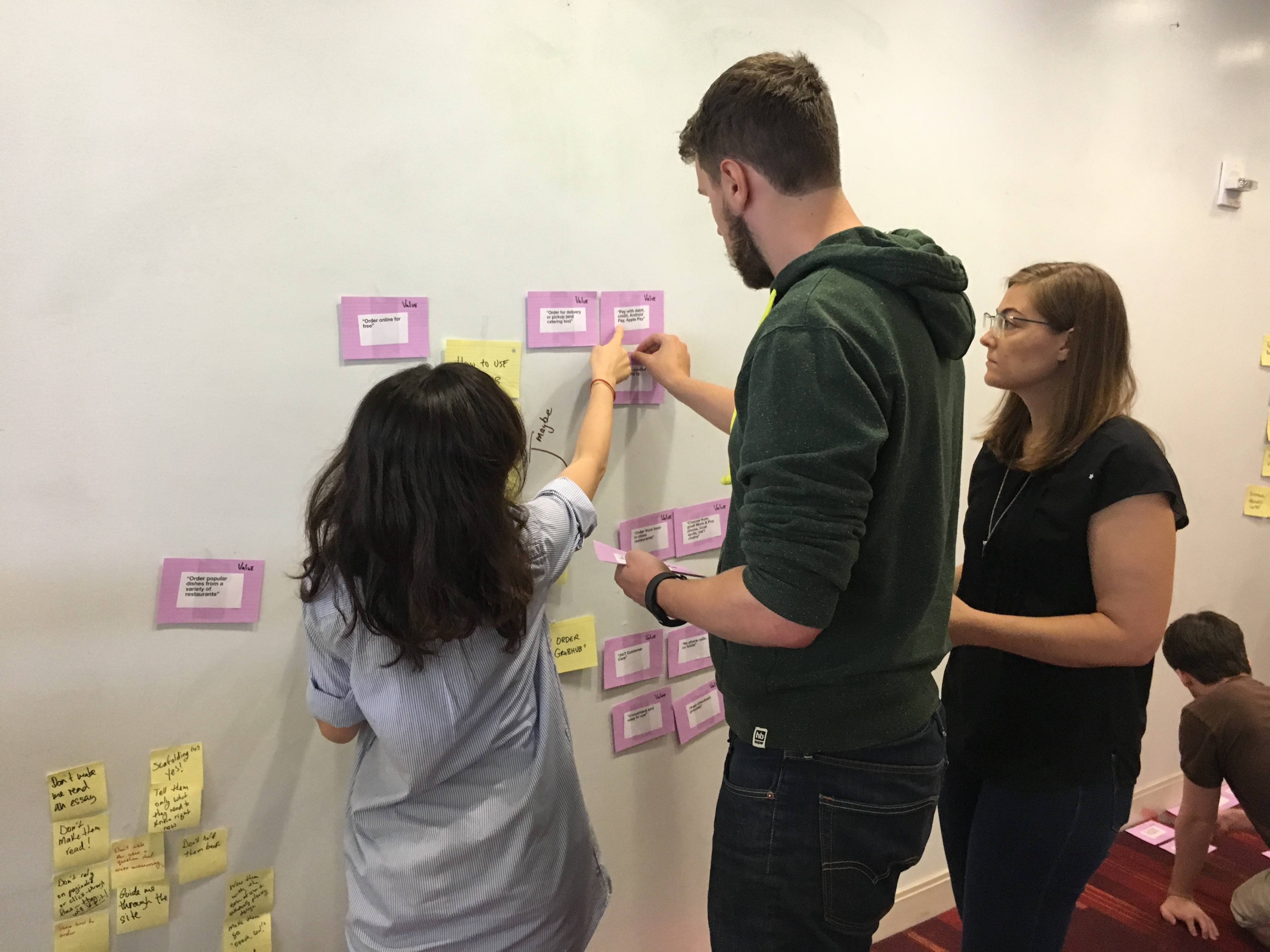
Everyone wanted to be involved in the process or at least know about it. It made sense, as this is our “front of house” in many ways. There was a lot of effort in gathering customer research, analyzing data, looking at competitors, and considering internal perspectives.
We had lots of brainstorming sessions to make sure we covered everything! We mainly focused on a few key goals that our customers were thinking about. Plus, it was great to see decision-makers get a real sense of what we were working on, which helped them understand things better and even challenge their own ideas.
So, what did we end up with?
Make customers really excited about food.
Confirm that this is Grubhub and about food delivery.
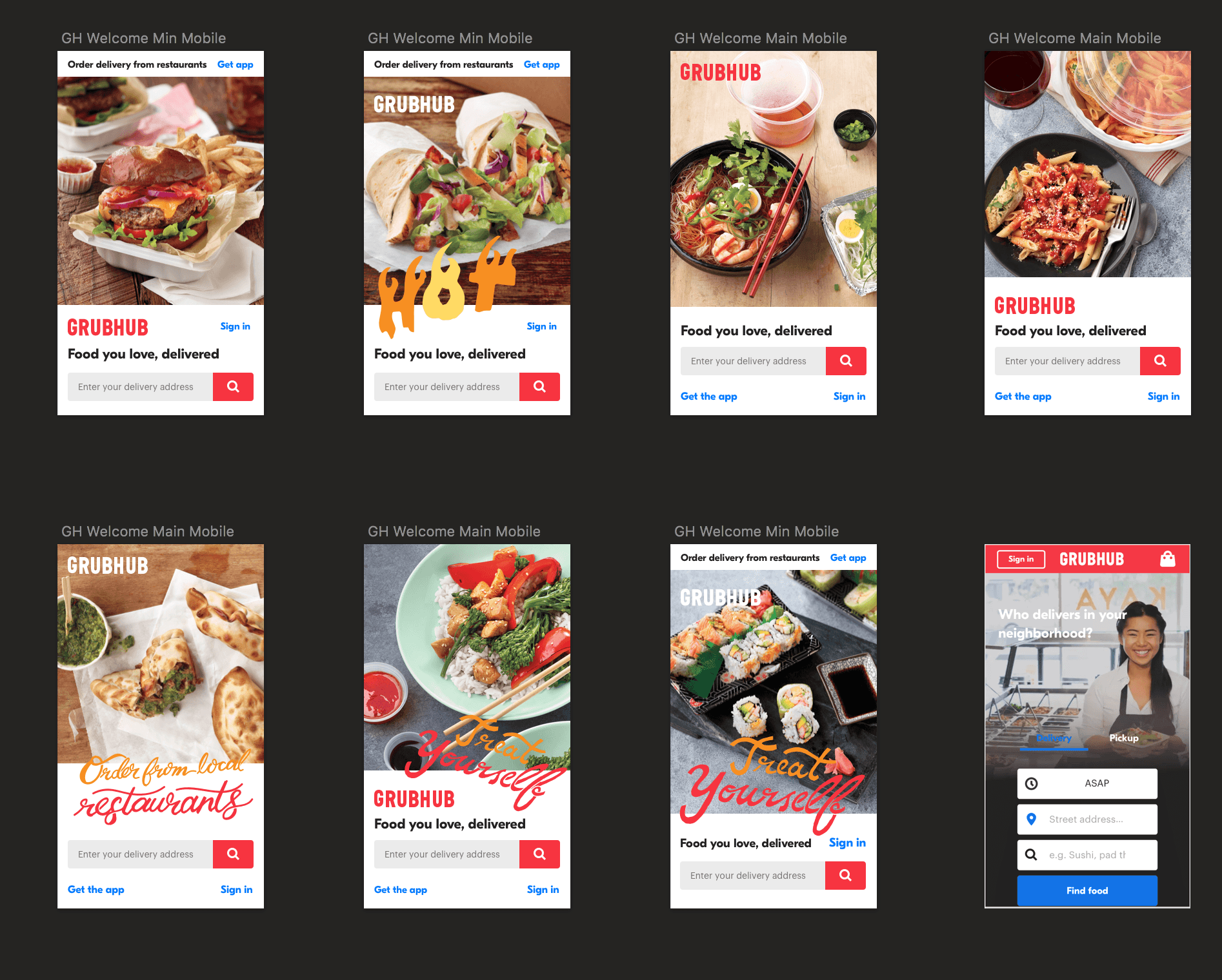
Keep the landing page simple with just three actions: input your address, sign in, and download the app.
When it came to designing and building the front-end, things moved quickly. We really focused on making it mobile-first. We even changed some of the usual button layouts to make the mobile experience even easier.
By the end, we had a team and leadership that were all on board with this project, and everyone was happy to see how well it did!